
So many reports focus on spitting out data that they often overlook the importance of being able to quickly digest the information and present a clear action plan. At Service Objects, we want you spending your valuable time acting on the results – not trying to make a report readable and understandable. As a result, we have invested considerable resources into ensuring our Batch Summary reports – the ones we provide you after we run your list – not only look great, but are immediately accessible and actionable. Your account executive will review the results of the report with you and answer any questions you may have, but you will also have a link to the detailed report for your reference and to share with your team members.
So how we did we improve the reports? We focused on telling your business’ data story and showing how our services can help improve your data accuracy. We have started with a few services and operations, and in the coming months, we will continue to roll out more of them out as they are ready. Some of the ways we tell the story better is presenting easy to understand charts and data breakdowns so that you can focus on the parts of your data that you are most interested in.
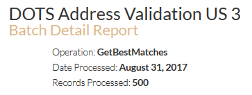
The following link provides a sample of our DOTS Address Validation US – 3 batch summary report and I have detailed out the features of the report below.
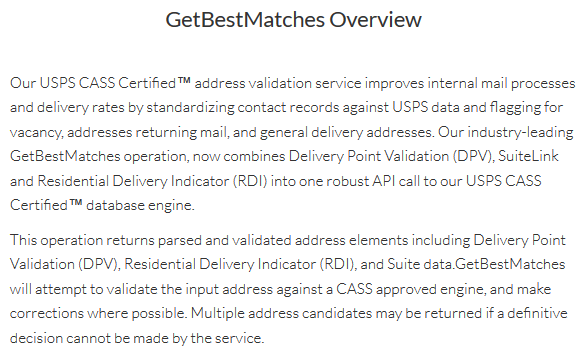
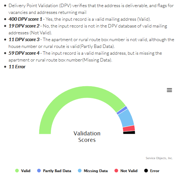
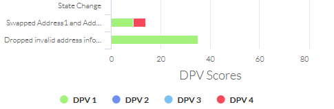
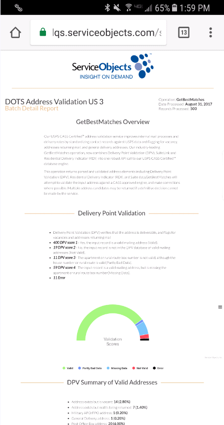
The summary starts with a brief description of the service and operation followed by a section where we define the main output of the service. In this case, the report is focused on Delivery Point Validation or DPV.
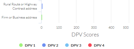
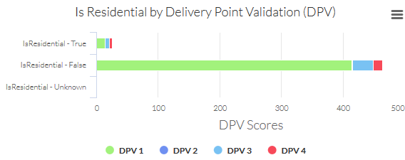
We show how the DPV results break down across the varying DPV notes, corrections and Is Residential data points. So, at a glance, it is easy to decipher the balance between the various DPV values.
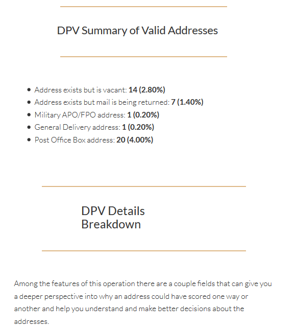
Throughout each report, when we see interesting data points, we shine a spotlight on them and add additional custom content to help highlight them.
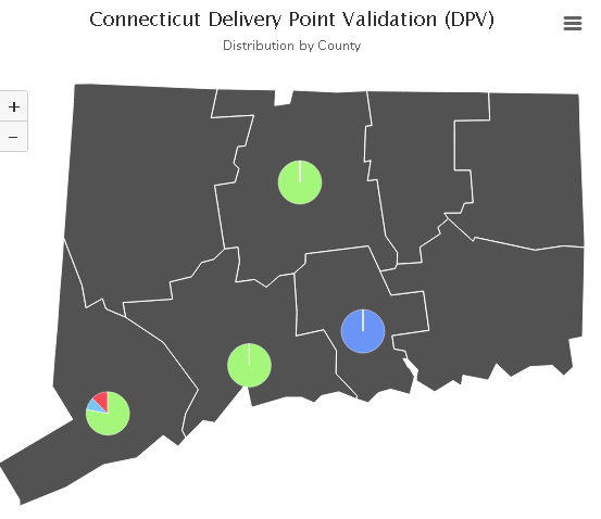
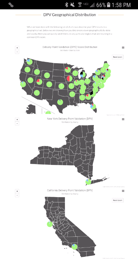
The report also drills down on the geographic nature of the data, showing how your list of addresses are distributed across each state and the country. The values are plotted on a map to provide a strong visual representation and hovering over a particular location also displays the underlying values.
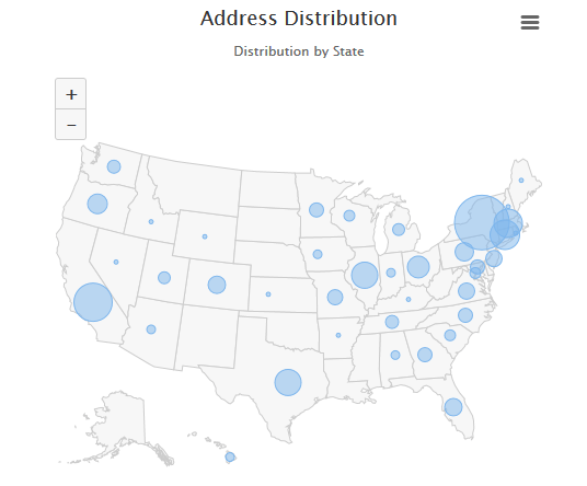
Included in this location distribution, is how the DPV values correlate to a location, where we overlay the pie chart breakdown of the actual DPV values.
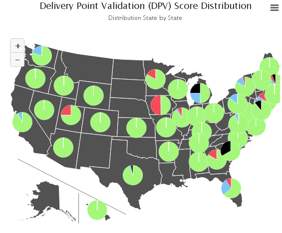
The break downs are by county and congressional district so your analysis can be completed very quickly.
Clicking on the three bars in the top right of any chart or graph will allow you to either save or print that particular chart. These new batch reports will also allow you to view your details from anywhere, on any screen size. No need to mess with PDF or specific file types, you just need an internet connection and a link to the report.
Lastly, we take data security very seriously. The reports are all provided very securely, so no one can see anyone else’s reports and data is never shared. Our hope is to provide a clearer understanding of your data, making it fast to digest and act on. If you have any questions or would like to us to run a sample data set for you, please contact sales@serviceobjects.com.